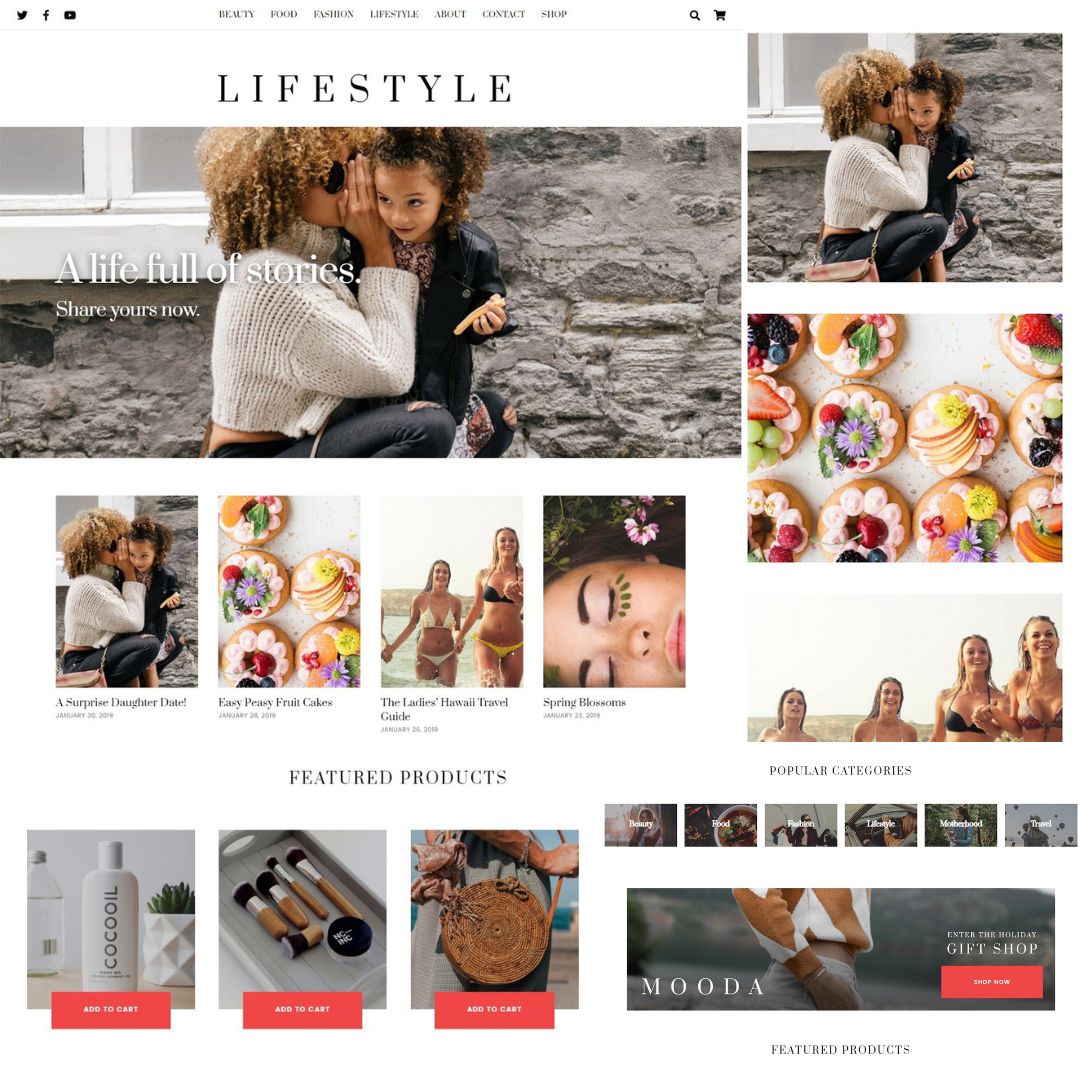
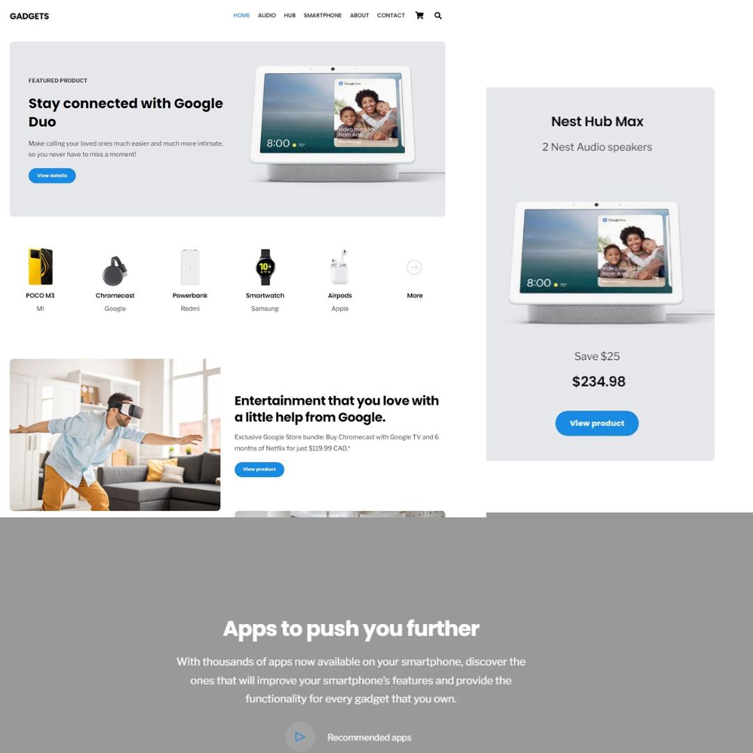
In online business, having a responsive website is non-negotiable. A responsive WordPress theme offers the solution, making your website look great and function seamlessly across all devices. Know the importance of responsive design with Themeholt and how it can improve your online presence, attract potential clients, and ultimately drive business growth.
The Importance of Mobile-Friendliness
With mobile internet usage overtaking desktop usage, websites have to focus on mobile friendliness. Responsive WordPress themes make sure that your website is accessible and user-friendly on smartphones and tablets, allowing you to reach a broader audience and maximize engagement. Additionally, Google and other search engines prioritize mobile-friendly websites in their search results, meaning that a responsive design can positively impact your site’s visibility and search engine rankings.
Why Responsive Design Matters
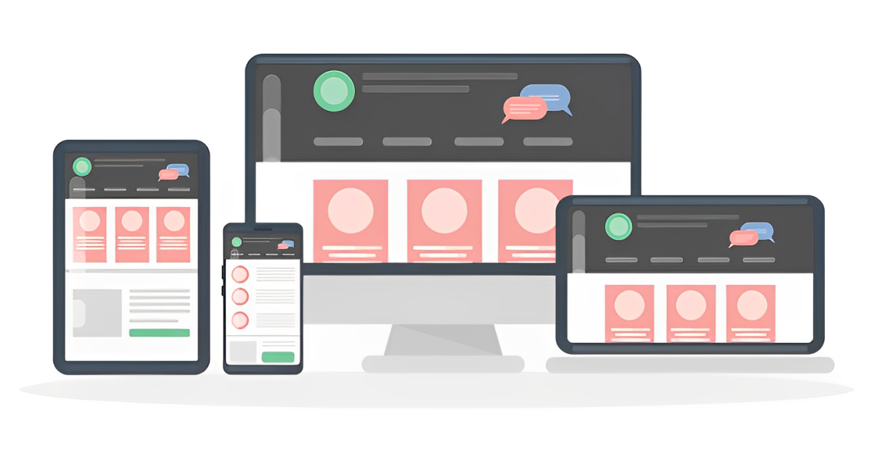
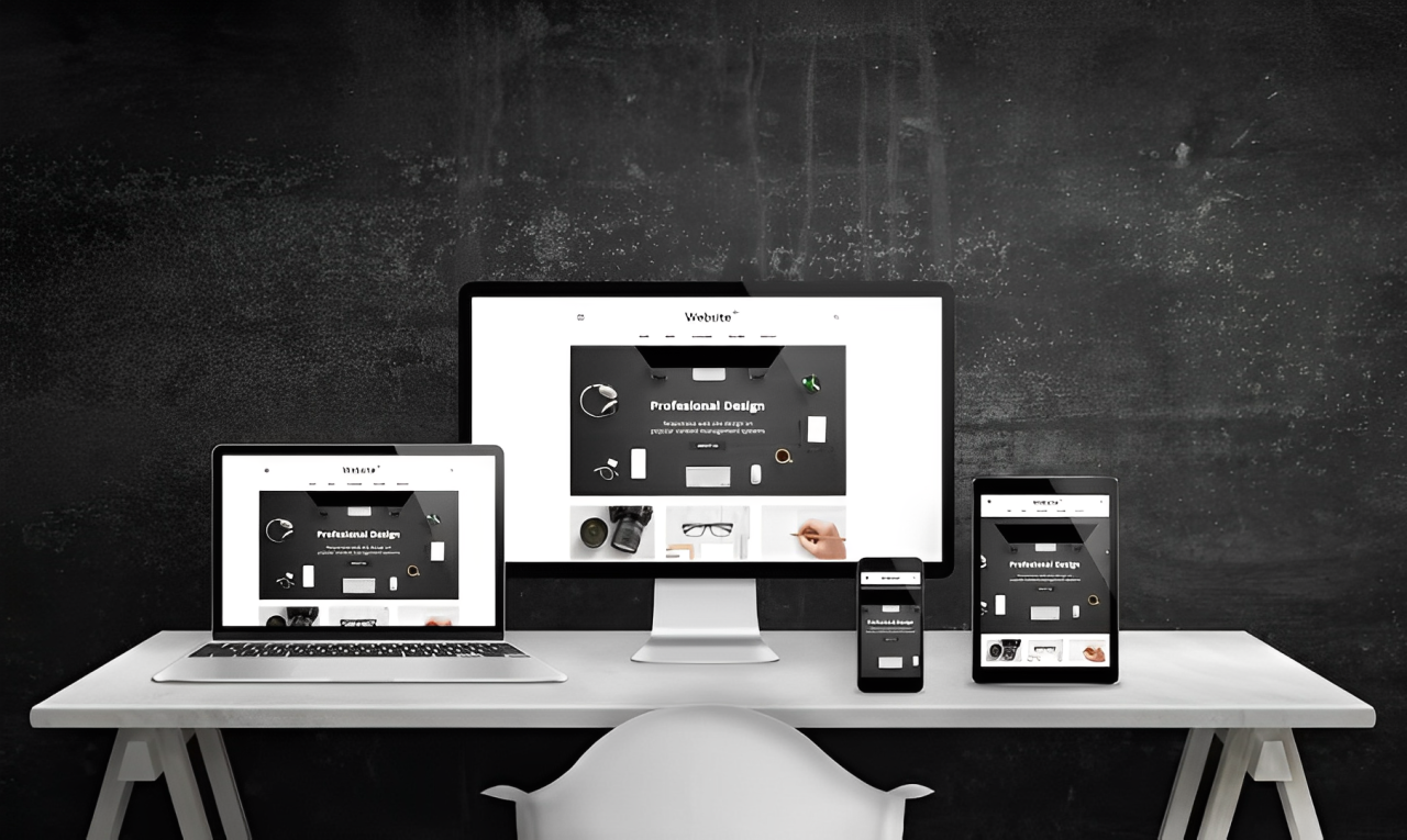
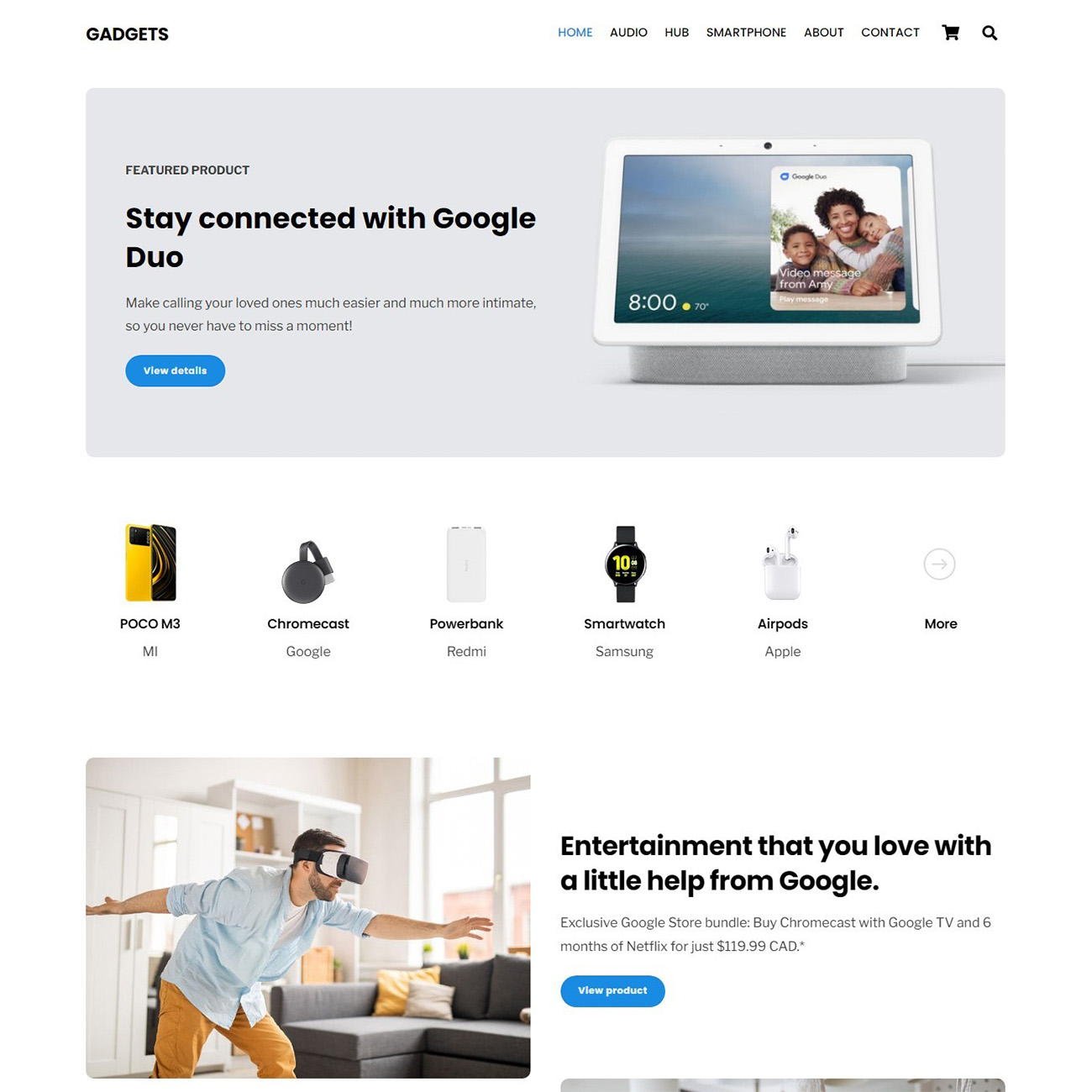
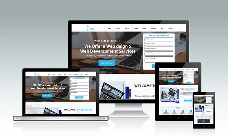
Responsive design makes your website adapt to different screen sizes, providing an optimal viewing experience for users on desktops, tablets, and smartphones. By embracing responsive WordPress themes, you eliminate the frustration of zooming and scrolling, making it easier for visitors to engage with your content.
Maximize Reach and Engagement
With mobile internet usage on the rise, having a mobile-friendly website is essential for reaching a broader audience. Themeholt mobile-friendly themes enable you to tap into this growing market, attracting users who prefer to browse on their smartphones or tablets. By optimizing your site for mobile devices, you can increase engagement and keep visitors coming back for more.
Improve Search Engine Visibility
Google prioritizes mobile-friendly websites in its search results, meaning that responsive design can directly impact your site’s visibility and search engine rankings. By choosing responsive WordPress themes, you can maximize your SEO efforts and increase the likelihood of appearing at the top of search engine results pages (SERPs).
Create a Seamless User Experience
Responsive themes provide a seamless browsing experience, allowing users to navigate your site effortlessly regardless of the device they’re using. By delivering a consistent experience across all platforms, you can build trust with your audience and encourage them to explore further.
Customization and Flexibility
Mobile-friendly WordPress themes offer a wide range of customization options, allowing you to modify your site to reflect your brand identity and meet your specific needs. Whether you’re a small business owner, freelancer, or blogger, there’s a responsive theme out there that’s perfect for you. Plus, with regular updates and support from theme developers, you can be comfortable with your website remaining secure and up-to-date.
Drive Conversions and Grow Your Business
The goal of your website is to increase conversions and grow your business. Responsive WordPress themes can help you achieve this by providing a user-friendly platform for showcasing your products or services, capturing leads, and encouraging visitors to take action.
Whether you’re selling products online or promoting your services, a responsive website is critical to maximizing conversions and driving business growth.
Conclusion
Opting for responsive WordPress themes is a no-brainer for anyone looking to upgrade their online presence. With Themeholt making your website adapt seamlessly to different devices, you can reach a wider audience and provide a better user experience. With improved search engine visibility and increased engagement, a responsive design sets the stage for business growth.
So, whether you’re a small business owner, blogger, or freelancer, investing in a responsive WordPress theme is an intelligent choice. Make your website accessible and user-friendly across all platforms, and watch as your online presence flourishes. Choose a responsive design and maximize your website performance.


